Friday, April 22, 2011

MENE, MENE, TEKEL UPHARSIN

The traditional recipe for a mural requires:
  • One (1) person wealthy enough to own a big wall; and
  • one (1) person talented enough to paint on it.
Unfortunately, these two ingredients don't always mix well. 

The reason for this probably dates back to ancient Babylonia.  The cruel and powerful King Belshazzar, worshipper of gold and merchandiser of the souls of men, had conquered all his neighbors.  He had nothing left to fear from anyone.  Yet, when he held a victory feast for a thousand of his princes and warlords, Belshazzar became rattled by markings he discovered on his palace wall:


Poet Sir Osbert Sitwell beautifully described this biblical story, and what happened when the great king saw the famous writing on the wall:
And this was the writing that was written:
"MENE, MENE, TEKEL UPHARSIN"
"THOU ARE WEIGHED IN THE BALANCE AND FOUND WANTING."
In that night was Belshazzar the King slain
And his kingdom divided.
Whatever the origins of the bad blood,  trouble seems to flare up regularly when artists write on the walls of the rich and powerful.  One side or the other seems to get weighed in the balance and found wanting.

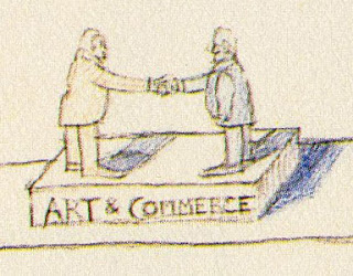
British shipping magnate Frederick Leyland commissioned James Whistler to paint a mural on Leyland's wall but then refused to pay Whistler's price.  Whistler returned to Leyland's house and changed the mural to portray Leyland as a vain peacock squabbling over a bag of gold.

Whistler proudly proclaimed that he had immortalized Leyland as a peacock (and in fact most people today probably remember Leyland this way).

In 1925 the great Frank Brangwyn was commissioned to paint a mural of "the British Empire" for the House of Lords.


Brangwyn put his heart and soul into what he hoped would be a great masterpiece, but after only five of the eighteen panels were completed, Brangwyn too was weighed in the balance and found wanting. the Royal Fine Art Commission, in a stunning display of bad judgment, rejected the mural.  Among the excuses later offered was the fact that the panels, designed as “a profusion of motifs drawn from all over the world, a rich brightly-hued tapestry of allusions to Africa, India, Burma and Canada, teeming with humanity and exotic birds and beasts,” were not appropriate for the traditional staid English decor. 


Five years later, Brangwyn became enmeshed in another controversy over his murals for Rockefeller Centre in New York.  In 1934 he was selected by the fabulously wealthy Nelson Rockefeller to paint a mural  on the theme “Man at the Crossroads.” Brangwyn's mural included a picture of Jesus but the Rockefellers ordered it removed, so Brangwyn ended up repainting Jesus with his back to the viewer.  In the words of Bertram Wolfe, Brangwyn made Jesus turn his back “upon the Temple of the Money Changers.” 

But Brangwyn had it easy compared to another muralist for Rockefeller Center.  Diego Rivera's entire mural was famously destroyed by the Rockefellers because Rivera refused to paint out an image of Lenin.   

Which brings us to Paul Le Page, the buffoon currently serving as Governor of the State of Maine. LePage removed a mural from the state's Department of Labor because the mural offended his "pro-business philosophy."   In what must be a new low in the history of human reaction to art, Le Page cited an anonymous fax complaining that in “communist North Korea... they use these murals to brainwash the masses.”

The artist, Judy Taylor, claimed that the mural was intended to depict milestones from the state's labor history, including Rosie the Riveter at Bath Iron Works and a famous 1937 shoe worker’s strike.  “There was never any intention to be pro-labor or anti-labor, it was a pure depiction of the facts.”


 At the time of Diego Rivera's battle with the Rockefellers, E.B. White wrote the following poem, which appeared in the New Yorker:
Said John D's grandson, Nelson.
[T]ho your art I dislike to hamper,
I owe a little to God and Gramper,

And after all,
It's my wall.....
We'll see if it is, said Rivera.
I think that White put his finger on the heart of many of these disputes.  Wall owners and muralists sometimes have different notions about who owns the wall in the more meaningful sense.  There is more than one kind of property.

Friday, April 15, 2011

An ODE to CONTRAST (verse 6)

Because contrast is a game of extremes, it gives an artist license to cast aside nuance and embrace all kinds of lurid and gorgeous combinations of color and form.

Frank Tenney Johnson

George Innes

Carl Spitzweig

Still, it's not true that the farther apart the elements, the greater the contrast.  On the contrary, contrast has to remain confined by a common set of rules or it becomes less effective.  Contrast between elements of equivalent weigh tends to create tension, while contrast between elements of unequal weight tends to create movement.  Either of these relationships can be powerful, but they require the elements to be tethered together if we want to create the illusion of greatest distance between them. 

If you just try to place elements as far apart as possible, without a common set of assumptions, you run the risk of punching a hole in your picture, through which all of the integrity of the image will simply drain out onto the floor:

Wednesday, April 13, 2011

An ODE to CONTRAST (verse 5)

Contrast is like those bad boys your mother warned you to stay away from but you just couldn't help yourself.

When you first encounter a picture, your eye is irresistibly drawn to the points of greatest contrast.    Other parts of the picture-- the largest shape, the prettiest color, the darkest or lightest form-- may strive for your attention but there's something about contrast that always catches our eye first.

In this painting by Motherwell, our eyes pass over the huge black shape and go right to the tiny corner with the contrast.

Milk contrasted against the shadows in N.C. Wyeth's lovely painting

Arthur Mitchell
This doesn't mean that contrast is the best or the most important part of a picture.  To the contrary, pictures contain many other fine, respectable elements.  As your mother told you, once you get past first impressions you may learn to appreciate subtle details and other less glamorous virtues.  All it takes is patience and time.

Harvey Dunn
You can go on to enjoy a long, satisfying relationship with the less flashy components of a picture.   But it seems that a mature relationship must wait its turn, until we get beyond our initial fascination with contrasts-- that rough, vulgar but sexy feature that first catches our eye.

Monday, April 11, 2011

An ODE to CONTRAST (verse 4)


When Alex Raymond drew the comic strip Flash Gordon, he often used  smooth, tapered lines that flowed seamlessly from light to heavy, from narrow to wide.


They were dazzling.  However, as he matured as an artist, Raymond no longer worried so much about blending the two extremes.  Instead, by the time he drew the strip Rip Kirby years later, he would contrast light, airy pen strokes with thick, choppy brush strokes, leaving them to co-exist on the page in sharp juxtaposition to each other.

Compare the subtlety and precision of Raymond's lacy lines forming the 
head and hands with the raw brush marks on the man's shoulder

Compare the strength of the chiseled effect on the man's overalls with the more refined, mellow lines in Flash Gordon (above)
A fine, diverse assortment of line. 
I promise you, this change in Raymond's approach was not because he forgot how to make smooth gradations in line.

Sunday, April 10, 2011

An ODE to CONTRAST (verse 3)

Artists have experimented for centuries with visual techniques for contrasting opposites.  However, it is difficult to think of an example which has benefited from so much enthusiastic experimentation as the contrast of something small, pretty and vulnerable with something big, mean and scary:

Let's see if we can tiptoe around some of the murky reasons people enjoy pictures of women in peril and focus instead on the interesting contrast at the heart of this popular genre.

 The pulp magazine covers of the 1930s and 40s merely continued a tradition that stretched back to medieval paintings of St. George & The Dragon (where a helpless virgin was chained to a rock, to be gobbled up by a fierce monster) or silent movies (where a helpless girl was tied to railroad tracks, to be run over by a fierce steam engine).  No mere gun or knife would do; it was the enormity of the disparity that makes these works successful.

As Frazetta shows us, sometimes it heightens the excitement and dread if the pretty girl lacks even a thin layer of clothing to shield her. 


But not every example uses nudity to heighten the contrast.  Some heighten the contrast employing  light vs. shadow, or vertical vs. supine compositions, or male lower class vs. female upper class.


Some artists believe they get more mileage from a threat that is a disembodied shadow, or by throwing a child into the mix:


Putting aside the politics of these scenarios, and regardless of whether the damsel is saved by a knight in shining armor or rescues herself, the contrast between these two extremes seems to capture the imagination.

Saturday, April 9, 2011

An ODE to CONTRAST (verse 2)

Saul Steinberg was an artist of insatiable intellectual curiosity.  His imagination overflowed with fresh, orthogonal views of the world and he came up with so many connections and comparisons that he sometimes had to stash long lists of them in imaginary cabinets and closets. 


Sometimes he went beyond words, and diagrammed the meeting of two concepts:


The juxtaposition of these concepts is plenty thought-provoking, and Steinberg's little diagrams add a nice touch of whimsy and mystery.  But I confess a special fondness for Steinberg's pictures where his contrasting concepts have been integrated into the pictures, not just spelled out in words.  Here, Steinberg puts a  mechanical, symmetrical image in bed with a fanciful flourish and leaves us to imagine their love life:


Here, Steinberg compares two realities using a clever graphic device:

In my view,  the contrast of these concepts is more successful in images than in words.

Friday, April 8, 2011

An ODE to CONTRAST (verse 1)

Peripheral vision may be our greatest weapon against ignorance.  Often your eyes don't need to stray more than an inch before they bump into a view of reality that is startlingly different from your own:

Matter and antimatter coexist in this catalog of classes from the Learning Annex
Of course, we can't always rely on our peripheral vision.  Sometimes we have to seek out contrasting views.   For example, if you were a young woman with artistic talent in the 1950s, you might find this type of ad quite persuasive:
Just look at my art director!
But unless you took the extra effort to read magazines for the opposite sex, you might never realize that the same art schools were wooing your male counterparts with a very different set of promises:

Do you like Art?


This may explain why some people argue with considerable lucidity on behalf of the virtues of blinders.

But for me, I'd say that in art-- as in life-- contrast is one of your very best friends.  Elements of a picture set in opposition to each other can heighten the effect of the whole.  The task of balancing opposing elements forces us to develop more complex and sensitive vocabularies, to register shades of meaning.  With these vocabularies we flesh out a more profound range of thoughts and feelings.  Contrast is the place where the enriching force is born.

By selecting the right locations between the top and the bottom of the musical scale, Beethoven composed symphonies. By selecting the right places between the top and bottom of the value scale, artists compose pictures. The aesthetic character of a line may be determined by an artist's selections on the continuum between rough and smooth, or delicate and bold.

This week will be my ode to contrast.  Each day I am going to post an example of a different type of contrast in picture making.  Let's see if we can have some fun.